Introduction:
When I started drawing on my iPad I did not know what the digital art coloring process steps looked like. For this tutorial I will be using Procreate, but there are similar ways to utilize these tips on other apps and software. In this tutorial, I’ll walk through my personal process for drawing and shading digital artwork. Whether you’re new to digital art or looking to refine your skills, I hope this guide will give you insights and an easy outline of steps for coloring in digital art.
I want to clarify that this is not the only way to color and shade. Some people forego lineart all together and render their pieces. At the time I’m making this, I am still relatively new to rendering, I have only done so once drawing Shadow the Hedgehog. In that example, I still use lineart!
In this step-by-step process I will be using a Digital drawing I did of Surge the Tenrec from the Sonic The Hedgehog IDW comics.
Ultimately everyone has different methods. My step-by-step method is:
-
- A sketch (digital or traditional)
-
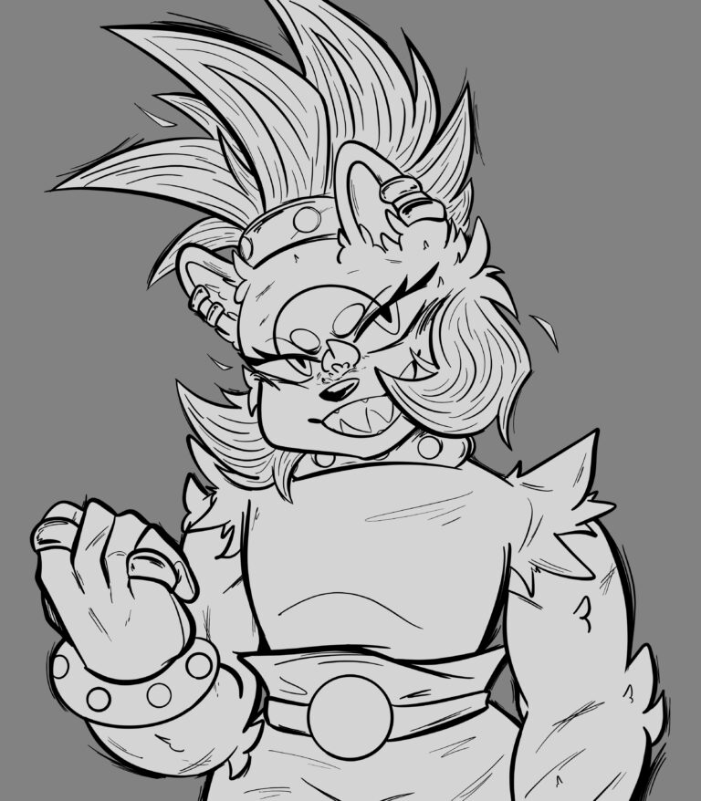
- Lineart
-
- Flat colors
-
- Shading
Step 1: Sketch
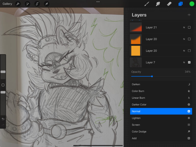
Recently, I have started with a traditional sketch, taking a photo or scanning it on my iPad, and then modify it.
I keep my sketch layer opacity lower, around 30%-35% so that I do not have issues drawing lineart over sketches. However, some people have a digital sketch on a separate layer, with varying degrees of details. Personally, I sketch out most details so that lineart is easier to go through. Sketching and lineart is half of the work for me.
Step 2: Lineart
Step 3: Flat Colors
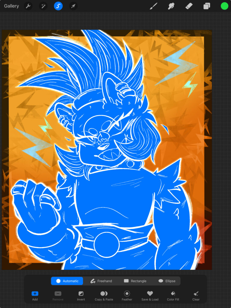
Quick tip: Two easy ways to transition from lineart to adding flat colors would be to either use your lineart as a reference or to auto select the outside space of the lineart and fill with the help of the selection tool. I utilize both depending on what I am coloring.
Procreate offers a great mini tutorial on how to use the auto selection tool.
Liminatii also provides a great tutorial on YouTube explaining some important and interesting things about working around the selection tool and using lineart as a reference. Start the video at 2:40 for the points on how to use your lineart as a reference as well as auto select!
Here’s a quick step by step explanation of how I utilize auto select to fill lineart:
1. Click the selection tool (top left corner with the ‘S’ icon).
2. Choose ‘Automatic’ as the setting. It will be highlighted in blue.
3. Tap the areas outside of the lineart, dragging so that the selection threshold is near 100% without selecting within the lineart.
4. Select ‘Invert’ and then fill in with a color.
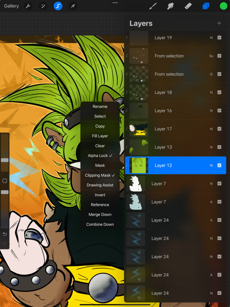
From there you can fill in the flat colors, or manually fill in colors. Since I fill the inside of the lineart with a solid color, usually white, I will use a clipping mask (as pictured in photo two) to add flat colors. This makes it easier to separate which section I am working on.
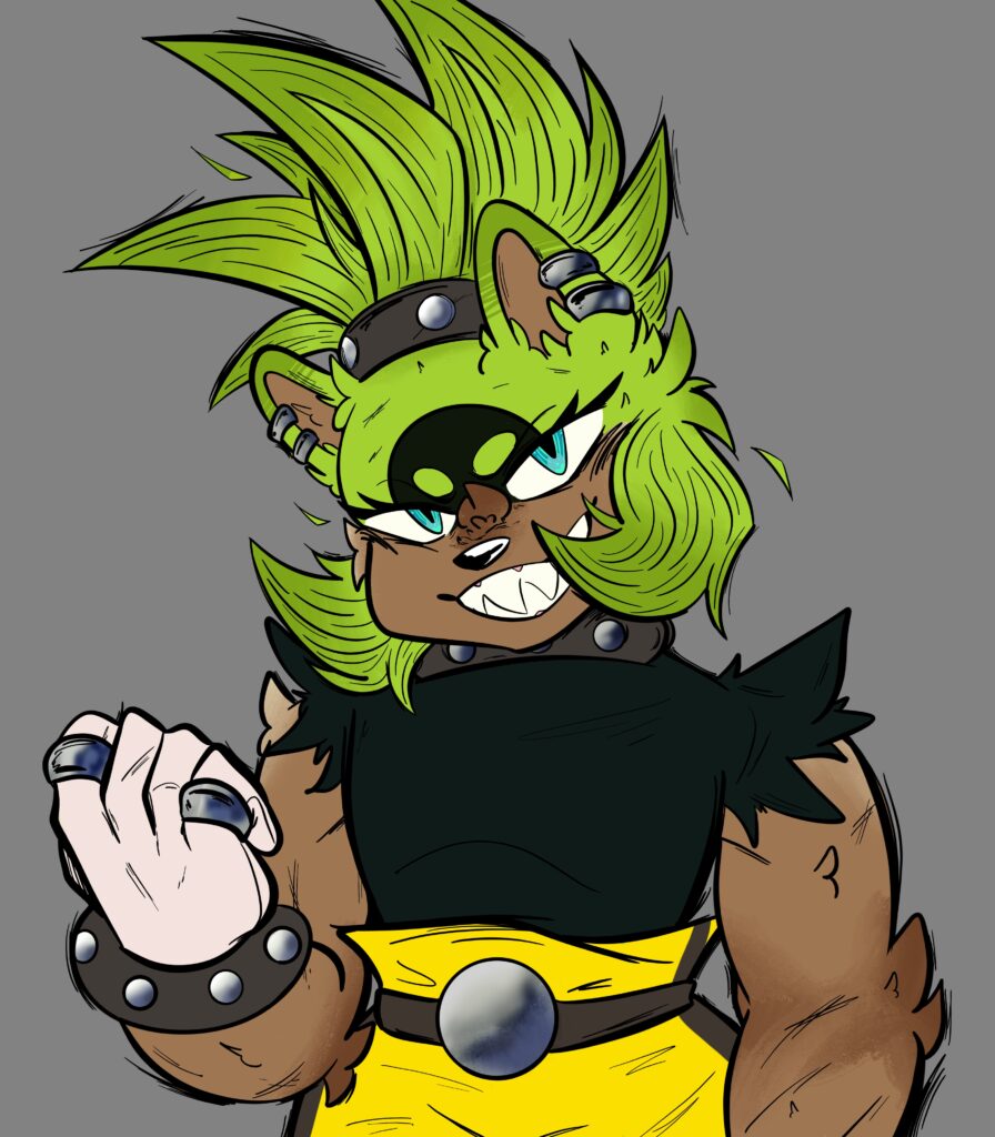
Step 4: Shading
If you notice, Surge looks a bit dull, so I am going to add shading and lighting overlays to create the finished piece. I first add a gradient on top of the flat colors, and then move forward to adding shadows and highlights. For this piece, the gradient is green, orange, and yellow, which will complement the character’s color pallet.
I utilize different blend modes for shadows and highlights. Oftentimes, I will use the overlay blending mode for shading and color dodge for highlights.
In this example, the gradient is on an overlay blend mode at 63% opacity.
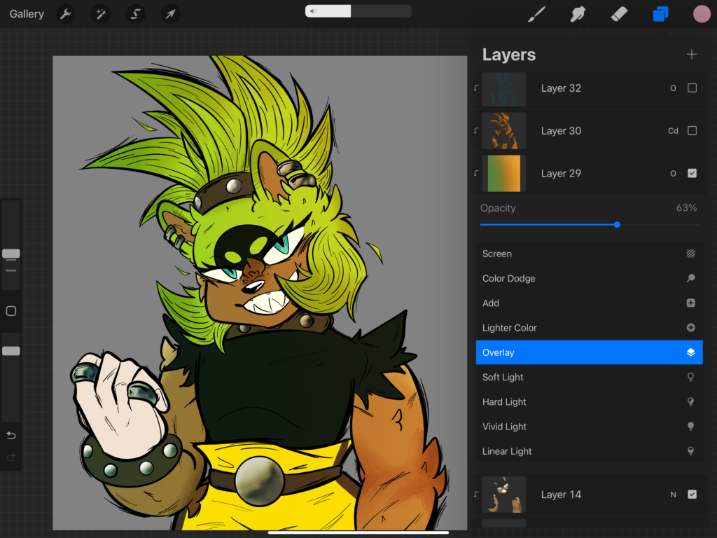
Here’s an explanation of how you can choose shading colors:
For getting into shading colors, I think you need either a basic understanding of color theory or you could choose colors based on pallets. I personally go with the latter, as I am still new to the concepts of color theory.
It’s all up to you how different the shading color should be, and it’ll take some time to experiment. Do not worry if the first choices do not end up working. They may turn out muddy or dirty looking but trying out different colors can make a world of difference!
In this piece, I used reds and oranges for highlights and grey-ish blues for the shadows. I blend these with the Thin Ink Brush from the Jingsketch: Basic 10 brush pack. Each color has a separate layer to be added onto the final piece. In this case, I can show or hide layers with ease.
After some trial and error with shading, you have the finished piece!
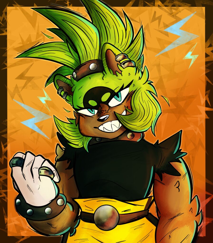
I initially wanted to share this process because I wanted to show an easy guide from an initial sketch to a shaded art piece. I hope this post can act as an alteration for anyone who needs more information!
Leave a Reply